
Color Theory: Understanding Color Choices
Color Theory organizes hues and shades of colors through a collection of rules and guidelines. It is used to create a logical structure for color and to create a harmonious balance between one another in design. Each color scheme is going to give your exterior a different energy: blue being calming, yellow more inviting, green more balancing. Color Theory is a practice created by Sir Isaac Newton in the 1600s to give a better understanding of how humans perceive color. Color Theory is made up of several aspects: the color wheel, color harmonies, and the colors' context.
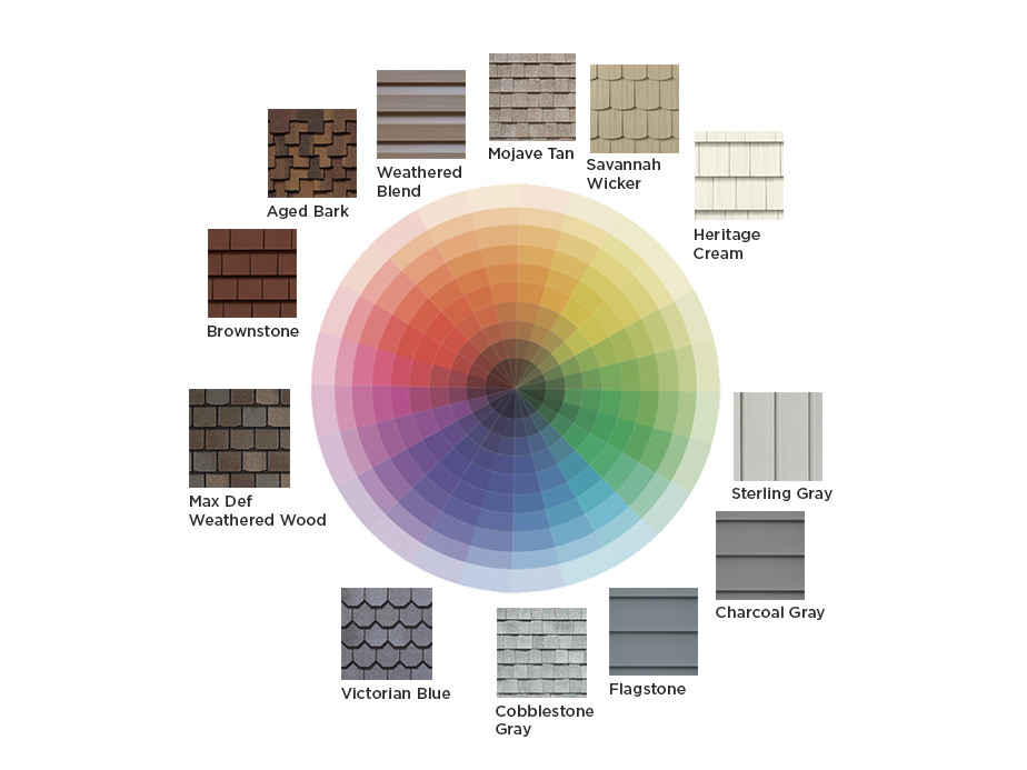
Color Wheel
The Color Wheel might just become your new best friend throughout this process. It is the basis of color theory, giving a visual representation of colors and their hues. It shows the relationship between primary (red, blue, yellow), secondary (green, orange, purple), and tertiary (combination) colors. Using the color wheel can help you visualize the best color scheme for the exterior of your home. A harmonious balance is the key phrase: the colors need to work together to create a balanced exterior.

The Importance of Undertones
A color is divided into two main parts: masstone, the most prominent visible color (and probably your reason for choosing it!) and its undertone, the understated pigments combined to make the masstone. When choosing your prominent color, it is sometimes difficult to pinpoint the undertones, but those subtle color shades can make a significant difference when combining with other exterior color elements; if the shade of one color clashes with the undertone of the other, it will create an unbalanced look within the space. Placing and moving your swatch around a color wheel will help to reveal its undertones; placing it near its complement or a similar shade will make the undertones more prominent within the swatch. Neutrals are the most difficult to pinpoint an undertone because they tend to be so muted, but using the color wheel can be useful in bringing that muted hue to the surface.
Finding Balance in Undertones
With undertones, two colors that might look similar to the naked eye, can appear completely different when placed next to a contrasting swatch. Or if two different siding colors are paired with the same roofing, the undertones of the roofing are going to pop according to the color of the siding. Placing multiples swatches around the dominant color will allow you to find the contrasts that make the most ideal combinations.
With these two example swatches, the left is a bolder choice because of the blue undertones of Flagstone with the orange undertones of Max Def Burnt Sienna. On the right, the pairing is more subdued and harmonious with the combination of brown tones.
With these two example swatches, the left is a bolder choice because of the blue undertones of Flagstone with the orange undertones of Max Def Burnt Sienna. On the right, the pairing is more subdued and harmonious with the combination of brown tones.

Color Harmonies
Monochromatic
A monochromatic color scheme is created by taking a single color and choosing between the different shades and hues to find its complements. The choice of your base color is key because from there, you can build out your scheme using a detailed color wheel. Focusing on different saturations and tones with the base color allows you to play around with various exterior shades: warm, cool, light or dark.

Products shown here:
- CedarBoards Single 7" Clapboard in Flagstone
- Cedar Impressions Double 7" Straight Edge Perfection Shingles in Pacific Blue
- Stonefaçade Ledgestone in Adirondack Snowfall
- Vinyl Carpentry
- Restoration Millwork Trim
Analogous
An analogous color scheme makes the work easy; the colors are sitting directly next to one another on the wheel (blue, blue-green, green). To create your analogous exterior, choose the base color, then a second to support it, and a third as the accent. We already know that these shades match well together to create a natural flow of color, but the trick is to make each one stand out. There must be enough simple contrast between each color to slightly break up that flow. You can do this by placing the accent colors in distinguishing areas of the homes' exterior.

Products shown here:
Encore Double 5" Clapboard in Desert Tan
Complementary
A complementary color scheme uses opposite colors on the color wheel to create maximum contrast, red and green for example. This is a bolder choice for your home's exterior due to the contrasting color combination, but when done right it can give the home a definite statement look. The complementary scheme can be split between two, or even three, color choices, the latter which allows one color to stand out and the other two to complement. To create this triangular scheme, take the two colors adjacent to the base color's complement.

Products shown here:
Color Temperatures
Warm and Cool Colors
There is a diving line between warm and cool colors on the Color Wheel. Like choosing a light or dark color for your home's exterior, a warm or cool color choice helps to set a signature mood for the home. Shades of red, yellow, and orange are considered warm colors and blues, greens, and purples are cool. A color like gray could be either, depending on its tones. When deciding between warm and cool colors, the climate can play a key factor. Warm colors tend to absorb more sunlight, while cool colors tend to reflect it.

Warm and Inviting
Colors like red, yellow, and brown are a solid choice when highlighting distinctive exterior features. Monogram blends are available in these tones, calling to mind the natural beauty of fresh-cut wood. Warm tans and grays make excellent accents to complement siding, and adding trim in darker shares (autumn red, terra cotta, mountain cedar) adds a nice contrast.
Products shown here:
- Monogram Double 4" Clapboard in Forest
- Cedar Impressions Individual 5" Sawmill Shingles in Cedar Blend
- Stonefaçade Harbor Sunset
Calm and Cool
A cool and calm home exterior finds inspiration in the blues, greens, and cool grays. If your home's exterior has many design elements, closely related colors will unify and simplify its appearance. Combining the siding with trim in a cool neutral tone (for example, charcoal gray or sterling gray) supplies an attractive counterpoint to more colorful siding, think Pacific Blue, Forest, or Spruce. When creating a calmer exterior, the goal is to limit contrast between colors and exterior features.
Products Shown Here:
- Restoration Classic Double 4" Clapboard in Midnight Blue
- Northwoods Single 7" Perfection Shingles in Granite Gray and Midnight Blue
Building Your Home's Exterior Color Palette
Learn how to create a color palette and view example color palettes designed by our experts.
